Open Site builder
- Sign in to Sherpo Dash
- Open your space
- Navigate to Site → Site builder
Pages
In addition to your homepage, Sherpo lets you create dedicated pages such as /pricing, /features, /courses, or any custom page you need.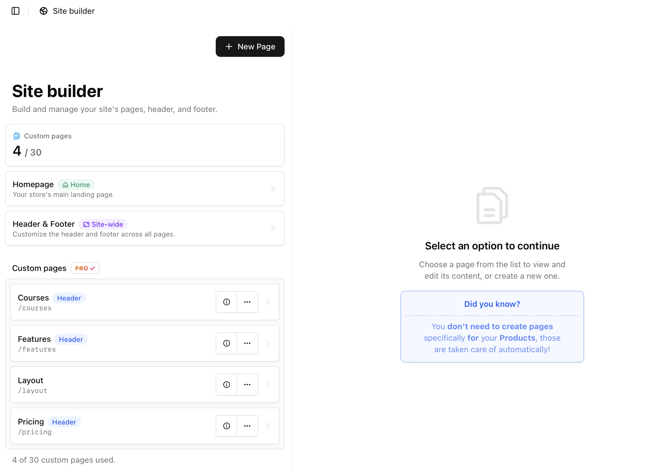
Create a new page
- Navigate to Site → Pages
- Click New Page
- Enter a Title and URL Slug
- (Optional) Add a Description
- Optionally toggle Add to header to display the page in your top navigation (up to 3 pages can appear in the header)
- Click Create Page
How Site builder works
Inside each page you will see:- A list of blocks on the left
- A live preview of your site on the right
- Device and theme toggles at the top of the preview
- Blocks render from top to bottom
- Each block is independent
- Reordering a block never breaks other blocks
- Header and footer are global sections
- Everything in between is fully customizable

The editor and live preview
Site builder is split into two panels:- Left side: block list and editing controls
- Right side: a live preview of your page that updates as you add, remove, hide, or reorder blocks
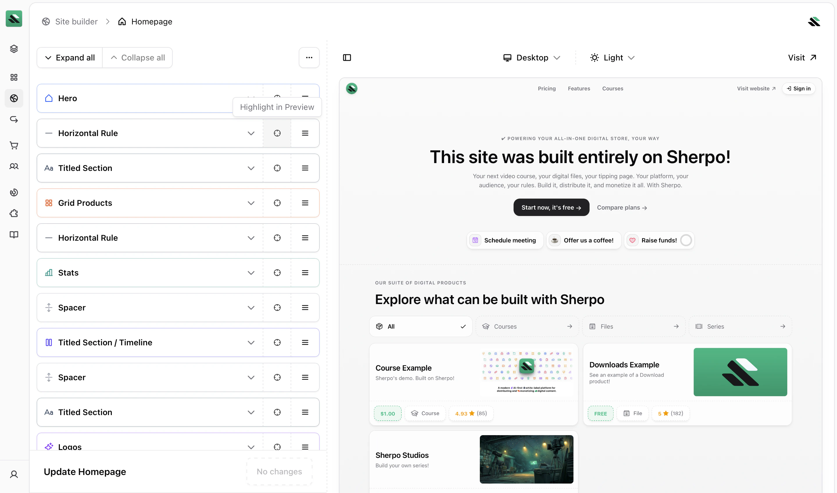
- Toggle Desktop, Tablet, and Mobile to see how the page appears across devices
- Toggle Light and Dark mode to preview both themes
Blocks explained
Blocks are the building blocks of your site. Each block represents a section of content such as text, images, videos, product listings, pricing tables, or FAQs. All blocks share the same core behavior.What you can do with any block
For every block you can:- Move it up or down
- Add a block before or after it
- Hide it (except global sections like the header and footer)
- Delete it (except protected blocks)
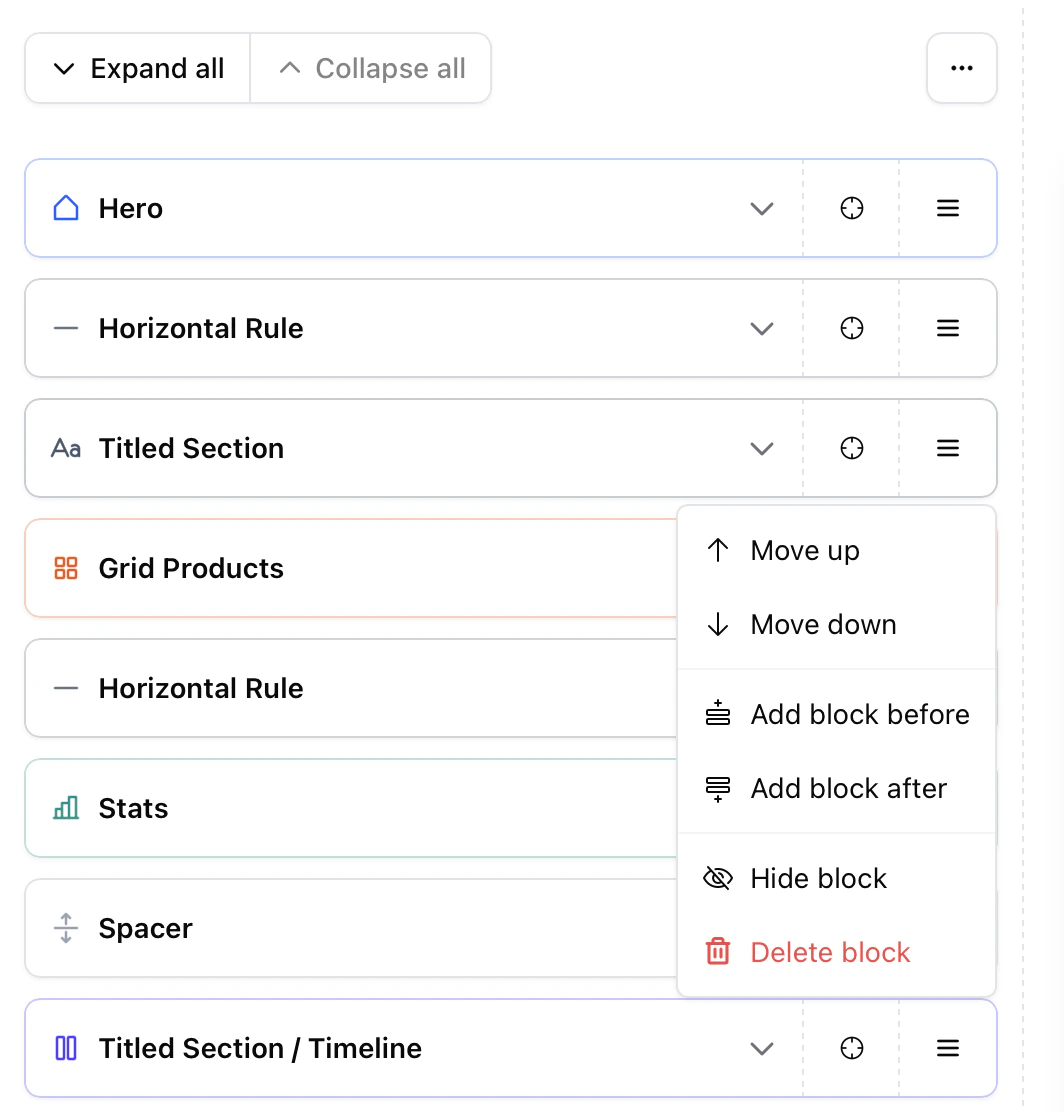
Hiding a block is useful for experimentation. Hidden blocks are not visible on your live site.
Hero block
The Hero block is the first section of a page and is included by default in every layout. It is designed to introduce the page with a clear headline and primary actions. While the Hero block cannot be deleted, it can be hidden if you prefer to begin your page with another section. Inside the Hero block you can configure the titled section (eyebrow, title, subtitle, description, alignment) and add Highlights, which appear as short bullet points under the hero content, commonly used to emphasize benefits. The Hero block also supports call-to-action buttons (CTAs). Each CTA includes:- Label — Button text
- URL — Destination link
- Style — Primary or Ghost
- Arrow — Optional arrow icon indicator
- Primary CTA → main action (e.g. Start now, it’s free)
- Secondary CTA → supporting action (e.g. Compare plans)
Add a new block
Click Add block to insert a new block. Blocks are grouped into categories:- Content
- Data
- Layout
- Products
- Utility
Block categories
Below is a quick overview of what each block type is best used for.Content blocks
Use Content blocks to add standalone elements.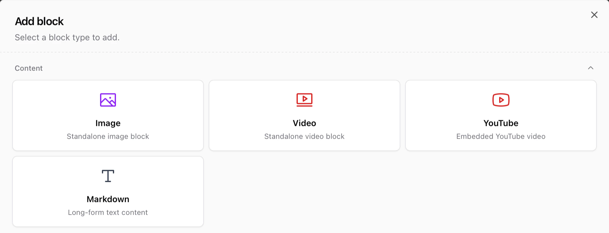
- Image — Add a standalone image for visuals, screenshots, or galleries
- Video — Upload a standalone video using Sherpo’s custom video player
- YouTube — Embed a YouTube video
- Markdown — Write long-form text such as landing page copy, policies, or explanations
Layout blocks
Layout blocks structure and organize other blocks.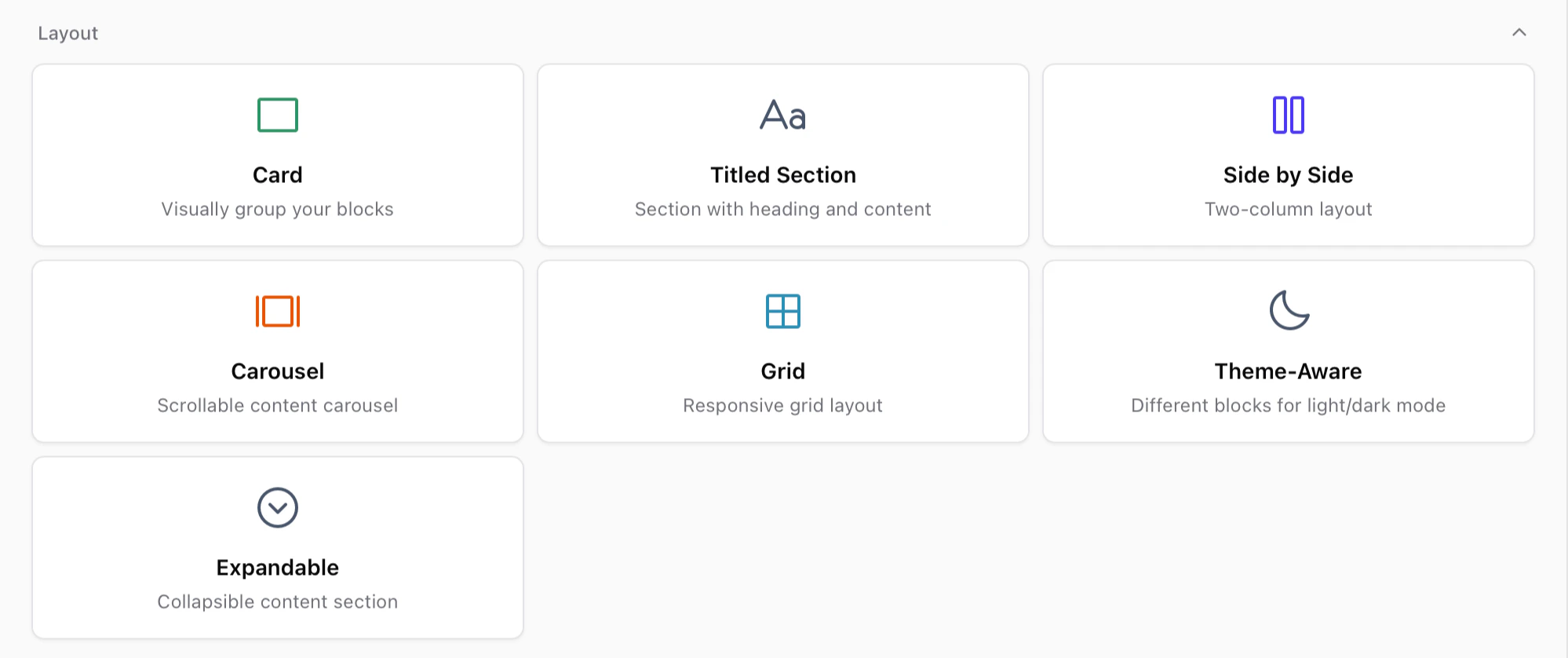
- Card — Wrap other blocks inside a styled container
- Titled section — Add eyebrow, title, subtitle, description, and nested content
- Side by side — Create a two-column layout
- Carousel — Display scrollable images or videos
- Grid — Create customizable column layouts responsive across devices
- Theme-Aware — Show different blocks depending on light or dark mode
- Expandable — Collapsible content sections
Layout blocks can contain other blocks. In most cases, blocks must be created inside the layout block rather than dragged into it.
Products blocks
Products blocks display items from your Sherpo catalog.
- Line Products — Display all products with line visibility
- Grid Products — Display all products with grid visibility
- Product Card — Feature a single selected product
Product order and visibility are managed in Products, not in Site builder.
Utility blocks
Utility blocks control spacing and layout helpers.
- Horizontal rule — Add a divider line (solid, dashed, or dotted)
- Spacer — Add adjustable vertical spacing
- Background image — Add a subtle full-page background image
Data blocks
Data blocks display structured information.
- Stats — Display metrics and key numbers
- FAQ — Collapsible frequently asked questions
- Pricing — Build SaaS-style pricing tables
- Timeline — Display sequential events or milestones
- Contact — Show contact information
- Logos — Display partner or customer logos
Compose sections with blocks
Complex sections are created by combining simple blocks. A common structure:- Titled section
- Side by side layout
- Markdown content on the left
- Image or video on the right
- Spacer
- Pricing or FAQ
Header and footer
The header appears at the top of every page and cannot be moved or deleted.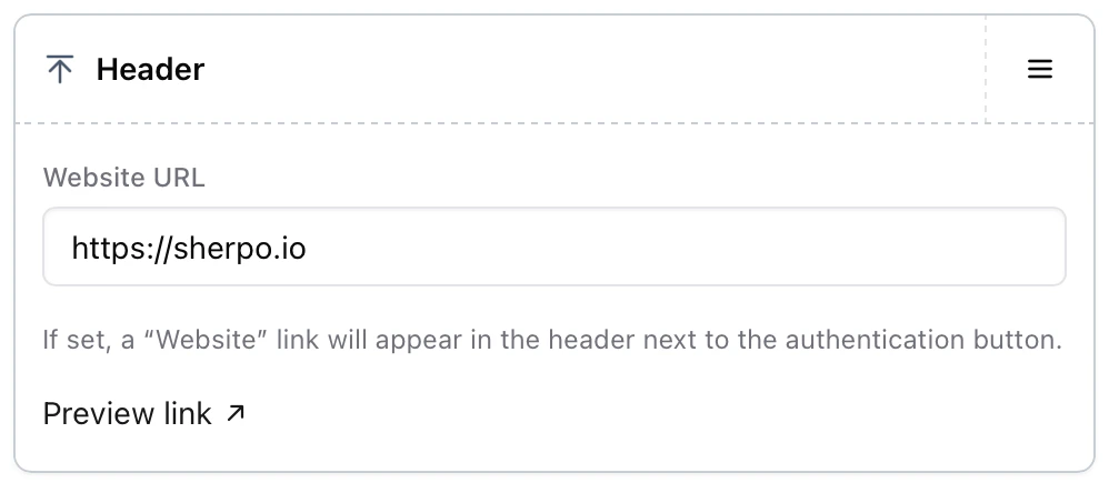
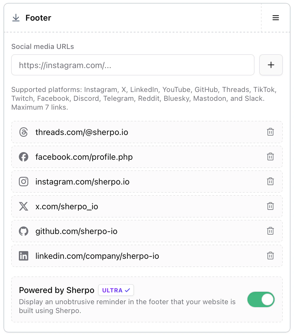
Best practices for creators
- Start with one clear goal per page
- Pair explanations with visuals using Side-by-side sections
- Add social proof early using Logos or Stats
- Place FAQs near the bottom
- Keep pages scannable with clear headings and spacing
Common mistakes
If your page does not look as expected, check these first.- A block is hidden: Hidden blocks do not appear on your live site.
- Changes are not live: Changes appear on your site only after clicking Update. Creators on the Start plan can edit and preview pages, but changes appear on the live site only after upgrading.
- Content was added to the wrong block: Some layout blocks contain internal content areas. Ensure you are editing the correct block.
Availability
Site builder availability depends on your plan.- Pro and Ultra users can publish changes to their live site
- Start users can build and preview layouts, but publishing requires an upgrade
Start users can freely experiment. Any page you build will be ready to publish immediately after upgrading.
FAQ
Who can use Site builder and publish changes?
Who can use Site builder and publish changes?
Pro and Ultra users can publish page changes to their live site. Start users can design and preview layouts but publishing requires an upgrade.
Can I reorder blocks freely?
Can I reorder blocks freely?
Yes. Blocks can be moved up or down at any time.
How do I find a block in the preview?
How do I find a block in the preview?
Click Highlight in Preview to locate the block in the page preview.
Can I preview mobile and dark mode?
Can I preview mobile and dark mode?
Yes. Use the toggles at the top of the preview to switch between devices and themes.
Does hiding a block delete its content?
Does hiding a block delete its content?
No. Hidden blocks keep their content and can be restored later.
Can I nest blocks inside other blocks?
Can I nest blocks inside other blocks?
Yes. Layout blocks such as Card, Titled section, Side by side, Carousel, Grid, Theme-Aware, and Expandable can contain other blocks.
Why can’t I move or delete the header or footer?
Why can’t I move or delete the header or footer?
Is the Powered by Sherpo badge mandatory?
Is the Powered by Sherpo badge mandatory?
No. You can disable it on the Ultra plan.